
Game of Thrones Infographic Makes its Way Around the Internet
A few weeks ago we were hired by international removals company 1st Move International to create and promote an infographic for them about the amazing TV show Game of Thrones. The company had already come up with all of the data which included calculations of exactly how much it cost to ship Daenerys Targaryen’s entire army to Westeros. All we had to do was make the information beautiful which is exactly what we did with help from our friends at Glow New Media in Liverpool.
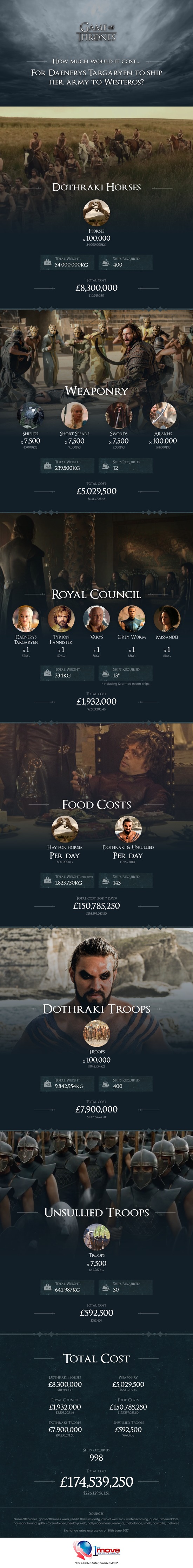
The stunning infographic shows how much it would cost to ship the Dothraki horses, the weaponry, the royal council, the food, the Dothraki troops and the unsullied troops across the Narrow Sea from Essos to Westeros.
Check it out:
Once the infographic was ready we sent it over to the client along with some tips on how to post it such as making the blog post wider and making the URL nice, short and tidy.
We then got cracking on the promotion by first of all posting the infographic to the Game of Thrones section on Reddit, which is always a great place to start with marketing your piece. The redditors absolutely loved it and the post went viral racking up over 6000 up votes and 500 comments which you can check out by clicking here.
From there the piece started to make it’s way around the internet and got picked up by some very prestigious websites such as Mashable and Esquire Magazine.
Traffic:
To be honest the piece didn’t do as well as you might think as far as traffic goes. The thing is that when blogs and websites link to an infographic they generally post the piece themselves which means there isn’t any need for people to click that link, but that doesn’t really matter because most of the time the client is more interested in links than traffic. Anyway here are the hits the infographic got for the 1st week.
05/07/2017 – 147
06/07/2017 – 206
07/07/2017 – 153
08/07/2017 – 55
09/07/2017 – 27
10/07/2017 – 47
11/07/2017 – 33
Social:
As we do with all of the infographics we work on we posted the piece on as many social networking sites as we could think of including all of the well known ones such as Facebook and Twitter as well as lesser known ones like Imgur and 9gag. Check out the votes and mainly positive comments it received.
Facebook – 29 shares
Twitter – Unknown
Stumbleupon – 71 stumbles
Linkedin – 81 shares
Reddit – 6584 up votes and 547 comments
Imgur – 40 up votes and 20 comments
9gag – 12 points and 9 comments
Dashburst – 303 views
If I were to include the social shares from other sites that published the infographic then the numbers would be much higher.
Links:
Now for the juicy bit, here are what in my opinion are the 10 best editorial links that the infographic has received so far. I have included the Moz.com domain authority scores but bare in mind a higher score doesn’t always mean that it is a better link, sometimes there is a bit more to it than that.
Mashable – DA 95/100
LaVanguardia.com – DA 88/100
The Daily Dot – DA 82/100
Holy Kaw – DA 80/100
Bristol Post – DA 75/100
Esquire Magazine – DA 71/100
Shortlist – DA 65/100
Filmstarts.de – DA 64/100
Cool Infographics – DA 64/100
Winter is Coming – DA 59/100
Overall the infographic got well over 30 proper links. To view the full size infographic along with information about how they came up with the data and that – Click here
If you want us to design and promote an infographic for your business then get in touch.